Learning objectives: 1.1; 1.2; 1.3; 1.4.
Excuse my tawdry attempt to gain visitors to this blog by tapping into the current obsession with all Things Strange ( and if you haven’t seen Stranger Things yet, why are you reading this? Stop. Now. Go straight to Netflix, sign up and binge on boxset-brilliance for the next few days. You’re welcome) but I’ve achieved the unheard of and managed to edit my Postcode Project not-so-short shortlist down to the required final 11.
We spent an age in class going through the 40 odd images I’d had printed. (My fellow students, I salute you for your patience and kindness). And, eventually, we were more or less decided on what the final eleven should be. Accepted, there was a bit of a heated debate about the park shots. One school of thought was that I should include some of the colour images. But Igor was having none of it; I was inclined to agree.
Then I got home, got the pics out to show someone else and completely ballsed up which ones were in which pile.
And so I’ve spent much of this week just staring at the different groups until I could (ahem) see the wood for the trees.
One thing I was surprised by was the pictures printed in a gloss finish were noticeably darker than their lustre versions. Sometimes this worked to good effect. Sometimes the loss of detail was unfortunate. Whether this was down to my editing, I don’t know. I had dropped the screen brightness down to 50% while editing (so as to compensate for the difference between printed image and a backlit computerised image) but maybe I need to drop it down even further next time? That said, some of my peers’ had shots printed on both gloss and lustre and there was nowhere near the difference that I experienced, so maybe it was an issue at the printer?
Regardless, I liked the gloss finish on some of the shots – the river images, for example – so I figured I’d re-edit a handful to compensate for this and get them reprinted before today, but I spent the weekend in bed with yet another vile lurgy (still not a euphemism) and I ran out of time and energy.
The final 11 aren’t perfect by a long shot. And, truthfully, I should have had another crack at a few (the river ones, for sure: I know I can do better). But class is in two hours so here’s what I’ve gone with. I can’t set them out here how I’d like to – one of the downsides of not having a pro-Wordpress account – but I’ve gone with the 11 I think a) best fit the 3 briefs and b) work well enough together in the sets.
APERTURE:
Super sharp shots; great light; varied aperture and a fabulous model: Lola the Rhodesian Ridgeback. Taken with my 50mm prime lens, I’m especially pleased with the BCU’s sharpness (you can see right into her eye) and the bokeh. And while the two wider shots share exactly the same settings (f/3.5; 1/320; ISO 200; 50.0mm) I think they illustrate well just how distance from subject affects depth of field; compressing the background, the nearer you are to your subject.
Sorted.
Well, kind of. The light was beautiful but threw strong shadows. I didn’t want to dilute it with fill-in-flash, so I made some slight exposure adjustments in the editing process. I probably should have done more targetted editing on Lola’s neck in the mid-shot, as it’s very dark. I feel the shadows work in the BCU: I love the way the light is hitting her eyes. Printed in lustre, the detail is still visible. In gloss, less so: so I went with the lustre finish on the final cut.


SHUTTER SPEED
The session down by the river threw up some interesting shots and a phenomenal sunset. I experimented with longer shutter speeds and used an ND filter on some of the brighter shots (not shown) to allow for increased exposure times. I think this helped bring out the incredible sunset. You can see some of the rejects here. Some, though, were either a bit too soft to use or the contrast between the sunset and the riverbank darkness too extreme for my liking, even with some targetted editing.
While the two longer-exposure shots are a little soft (and I could have used a wider aperture, also) I felt that these three worked well to show the varying shutter speeds (from 1/13 to 20s) used that night. While one captures the stillness of the evening, the latter two conveyed movement well (the green lights are a rowing crew moving into shot). I also felt that the soft light of each worked relatively well together and wasn’t too sharp a jump between light and shade; unlike some of the sunset images from the shoot that would have possibly jarred tonally.


FIVE ON A THEME
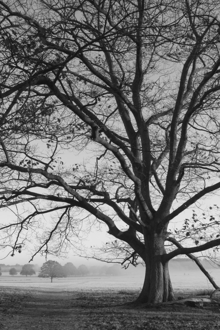
If I was to call anywhere “home” other than my actual house, it would be Richmond Park. I spend so many hours walking there each week; you could pretty much blindfold me and drop me anywhere in it and I’d know where I was within a second or so. It had to be part of my Postcode Project.
An icy, misty morning; I hit the park as the sun was just starting to rise. Dealing with the ever-changing light (from low mist to relatively bright sun on the large oak tree) meant that I had to constantly reassess my shutter speed, aperture and ISO. And while several of these images work well in colour, as a set I prefer the monochrome versions. To me, they better convey the feeling of isolation and space that I get when I’m in the park at this time, long before most other visitors. There’s a moodiness to the shots of the centuries’ old trees, which I like. I think most “good” trees have a very defined individual character when you study them closely. I hope I’ve captured that and managed to retain their uniqueness. One shot (where I’ve cropped into the branches) was taken a day or so later when the light was vile. Taken against an ashtray grey sky; the end result is quite abstract, and – combined with the delicate patterning and use of empty space – seems almost Oriental in style. The fence and the field shots are more obvious landscape shots, with leading lines drawing the eye through frame. I was drawn to them by their varying textures and depth of field. I’ve tried to apply the rule of thirds – either at time of composing the shot or later in the edit when cropping – and I think that helps provide a communal structure to the group.


So there you go. The final bitchin’ eleven.
Hope you like them.
(Oh, and as for the gloss/lustre quandry? At the very last minute I went with lustre for all those I submitted, in order to preserve detail and provide more depth of tone than the gloss versions provided.)
As with all my work this term; health and safety concerns (as touched on throughout this term’s blog posts including this one.) were adhered to throughout. The rowing shots were taken from the terrace of The White Hart pub in Barnes; so I sought permission to use my tripod and made sure that I did not create an obstruction to any other guests (not that there were any, it was proper cold. I had dressed accordingly, though, so avoided hypothermia ). I remained aware of my surroundings throughout, so that I was not in danger and neither was anyone else, and kept my kit safely bagged up.


Excellent shots 🙂
LikeLiked by 1 person
Thank you so much!
LikeLiked by 1 person